46 components live
BTIS Design System v1.0 →
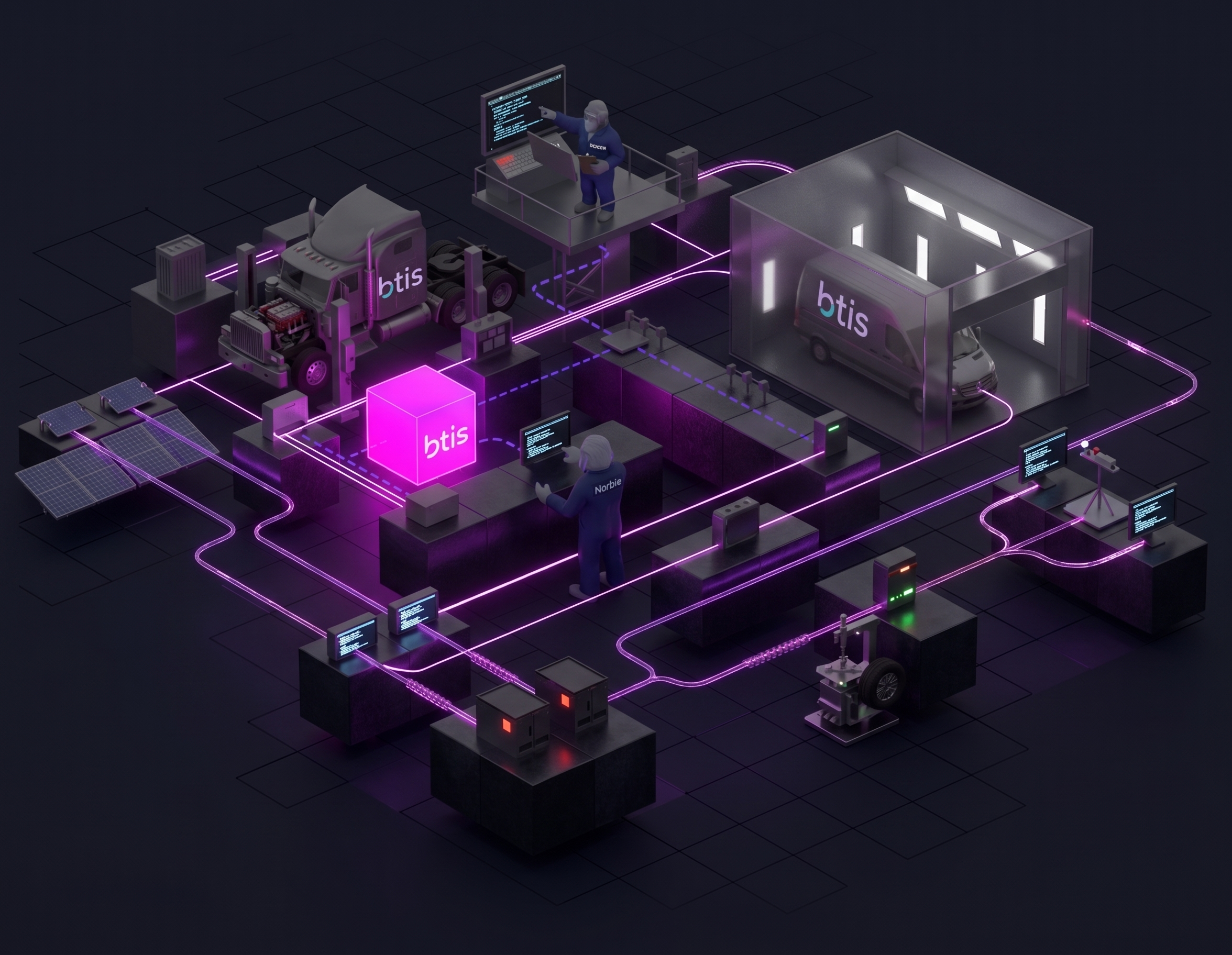
Design at scale.
Build with consistency.
A complete design language with foundations, styles, and 46 components — everything your team needs to ship great products.
Start exploringDiscover the system
powering BTIS products
Components
Overview
Details
Settings
Notifications
● Active
Email
user@btis.com
Dark Mode
Frequency
Daily
Weekly
Off
Cancel
Save changes
Tt
Typography
Montserrat — the BTIS typeface
Built on Montserrat across five categories — Display, Heading, Title, Body, Label. One family from 11 px microcopy up to 52 px display so hierarchy stays consistent everywhere.
Brands

The BTIS
Design System
Design System
Iconography
Norbielink
Meet Norbie

Hi, I'm Norbie
Your AI assistant
Tokens
color.brand.magenta
color.brand.purple
color.gradient.primary
color.brand.tint
color.surface.subtle
color.icon.muted
color.text.muted
color.brand.teal
color.bg.success
color.icon.warning
color.icon.info
color.border.default
color.text.primary
color.text.danger
color.text.heading
Featured components
View all →
Primary
Secondary
Button
Action
Save changes
Tooltip
Hint
● Sold/Issued
● Pending
● Renewals
● Declined
● Action Req.
Badge
Status
Delete item?
This action cannot be undone.
Cancel
Delete
Dialog
Overlay
Dark Mode
Notifications
Switch
Control
Tab content appears here…
Tabs
Navigation
Email
Password
Text Fields
Input
What is a design system?
How do I use it?
Is dark mode supported?
Accordion
Disclosure
JS
AB
MK
+3
Avatar
Identity
Stay in the loop
Follow our design journey to see new components, design tips,
and behind-the-scenes content from the BTIS team.